 Sometimes you want your dashboards to be dark.
And by dark, we mean dark backgrounds with light text and discernable colors. For many people who watch dashboards, looking for alerts and concerns, a darkened screen is more restful. And while research may have concluded that dark letters on a white background are easier to process, it also points out white backgrounds in a darkened environment may disrupt low light vision adjustments.
Scalyr dashboards are white, with dark text and colors in use to indicate the desired metrics. These dashboards are easy to read, understand, and clearly detail the tracked data.

However, it is reasonably easy to change this view by making use of the accessibility features in Chrome and Firefox. These reversed colors hack is not perfect as it impacts all of the sessions on the respective browser but quite suitable for a long-lived view or stable operations center.

This hack is also not making use of the system-wide accessibility features, so only the browser is impacted. In short, the rest of your applications and background are viewable as usual, but the view of your browser has changed. Just be aware that other activity on your tabs may have rather wild results.
Chrome offers several accessibility extensions that allow some control over the look of a page presented in the browser. These extensions are available in the Chrome web store and are easily found via the Preferences (or Settings) page. The extension allows easy toggling of visual impact.
Firefox has built-in preferences that allow you to create the dark scheme. While it is easier than Chrome, requiring no extension installation, it does not provide an easy way to toggle off and on. It does have additional personalization features and does not change the data representation colors. (Note, an add-on exists that allowed toggling but is not supported in FireFox Quantum at this time.)
A similar capability exists on Safari, Windows Internet Explorer, and Edge but requires a CSS stylesheet insertion. I will cover those in a later blog.
The following directions are from my MacBook; however, the same workflow exists for all Firefox or Chrome browsers regardless of operating system. If you are having difficulty with your version, drop me a comment and I will try to help out.
Come to the Dashboard Dark Side.
Step by step for Chrome:
- Open your Chrome browser.
- Click on the menu button.
- Choose the Settings or Preference menu item (alternatively, you could enter “chrome://settings” directly into the address bar).
- Scroll down the page and select Advanced.
- Scroll down to Accessibility and click on Add Accessibility Features. This click will open a new tab (or window).

- In the Chrome store, find High Contrast.

- Click on Add to Chrome. This click will open a pop-up window.
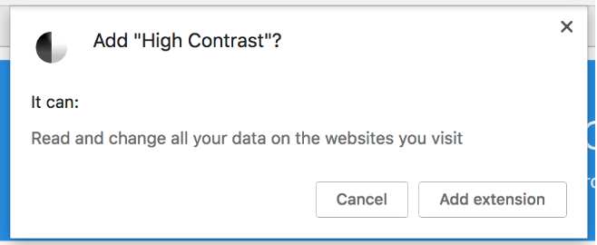
- Click Add Extension.
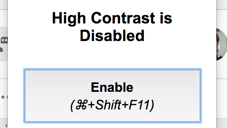
A small icon will appear in Chrome in the upper right corner. - Now the fun stuff. Click on the icon and Enable the extension. There are some cases where installing the extension automatically enables it. If so, just click the icon to bring up the selections.
- Now that the extension is enabled click on Inverted Colors.
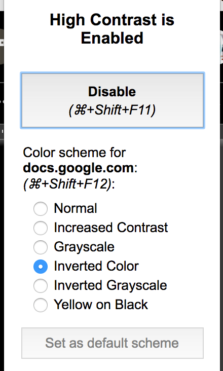
- To toggle back and forth, either make use of the keyboard accelerators or click the appropriate choice in the extension.
Step by step for Firefox:
- Open the Firefox browser
- Click the Menu button.
- Select Preferences or Settings (alternatively, you could enter “about:preferences” directly into the address bar).
- Scroll to Fonts & Colors (under Language and Appearance).

- Click on Colors…
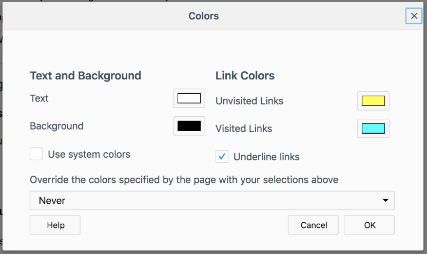
- In the Colors menu, change the associated colors.
- Text to White.
- Background to Black.
- Unvisited Links to Yellow (Optional).
- Visited Links to Light Blue (Optional).
Please note that in Firefox, you can use what colors you would like. The above choices are offered as a starting point.
- In the Override the Colors box select Always.
- Click OK.
Reversing this choice requires entering preferences again and setting the Override the Colors choice to Never. As noted, the extension that offered a toggle button is not supported in Firefox Quantum.
So there you have it, a quick and dirty approach to getting your dashboards in the dark.
However, note that these changes will impact all tabs and windows of the browser, not just the dashboard views. For that reason, you may want to limit this use to a long-lived display or make use of the toggle capability of Chrome.
To learn more about accessibility in Chrome, check out Use Chrome with accessibility extensions – Google Chrome Help. For information about accessibility in Firefox, take a look at Accessibility features in Firefox. And to learn more about dashboards in Scalyr, check out how log analysis can lead you to needed actions.
If you try it out, tell me about your experiences in the comments.

