People commonly say that a picture is worth a thousand words. So I wonder if log visualization is worth a thousand log entries. The math equivalency might be a little hard to prove, but the idea is worth exploring.
You’re recording all sorts of information in your log files, but are you visualizing that information?
Do you have dashboards and graphs that help you picture production behavior? Or does the information sit buried within digital mountains of arcane strings? The proverbial needle in the haystack? Does anyone who wants to use it need to engage in laborious searches?
If you’re not visualizing your logs, you’re missing out. But I don’t necessarily want to make the case for visualization today. Instead, I’d like to offer some ideas for visualization that you perhaps hadn’t considered. Let’s take a look at some use cases for log visualization that you might not have considered.

Prerequisites for Log Visualization
First things first, though. Before I can take you through the use cases, you need to have a setup that allows log visualization. Specifically, you need modern log file management, which includes the following things that concern us:
- Log aggregation (gathering and storing log files).
- Meaningful parsing of the data contained in the log files.
- Powerful search capabilities.
- Log visualization tools.
Don’t get me wrong. You could implement all of this stuff yourself. But then again, you could also implement your own source control and text editor. Just because you can doesn’t mean you should.
If you want to get serious about visualizing log files without burning tons of time, you need tooling and infrastructure in place to help you. Once you have that, though, let’s take a look at some of the things you might do.
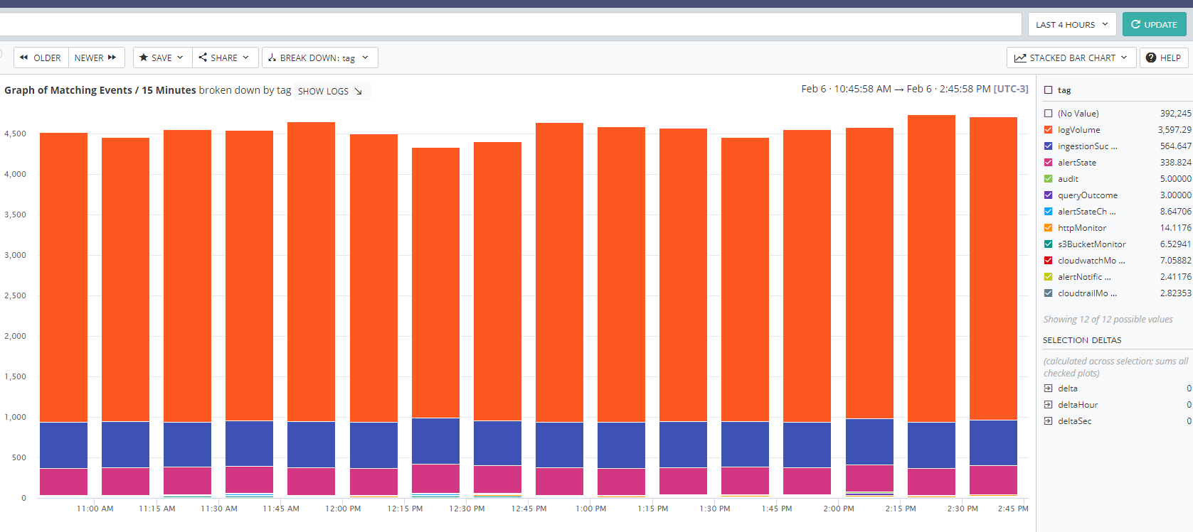
Chart a Breakdown of Your Log Messages by Tag
If you’ll recall, I talked some time back about good application logging practices. This includes categorizing and tagging entries/events in your log files. In short, you want to make it easy to group similar messages for different kinds of audits.

So let’s assume you’re doing that. One interesting way to visualize this breakdown would be to enlist the following tactics:
- View mutually exclusive categories of messages in a pie chart.
- View inclusive tags in a bar graph.
For both cases, you could pick an arbitrary length of time (or sample multiple) to gather. What you’ll have then is a breakdown of what sorts of information you’re recording in the log file. This gives you some meta-insight into your information gathering.
Are you focusing a little too much on a mostly pass-through service layer? Not paying enough attention to your underlying physical systems?
You’ll be able to tell at a glance.

See a Similar Breakdown by Log Level
You also have the option to do a similar kind of meta-information gathering. In this case, you can check out how your application logging looks by log level.
On the one hand, if you’re seeing a lot of fatal and error messages, you probably want to do some investigation. But at the other end of the spectrum, do you have a lot more informational logging than you need? Do you have trace or debug logging unintentionally going in production? Or if you have it going intentionally, is it swamping your files?
Again, you can check out all of this at a glance with log visualization in a much more impactful way than just by, say, counting up messages over a period of time.

How Many Messages Are Structured?
So far, I’ve talked about visualization use cases that examine your application logging practices and settings. But what about the entries themselves? And what about log visualization that you monitor as a trend, hoping to improve?
Earlier, I talked about the importance of structuring your log messages using an approach like key-value pairing them. Well, that probably won’t happen all at once, and it’s harder to get them into that format when they come from third-party logs.
But at any given point, you could track how many of your events come in structured as key-value pairs and how many don’t. Over the course of multiple releases, you can monitor your progress in formatting messages the way you want.

Check Out a Breakdown of Your Application Exceptions
If people working on your application code regularly run a profiler, they might have some insight about common exceptions their code may generate. Or they may have no idea. After all, they probably can’t recreate production conditions very well in staging, let alone at their desks.
To give them an idea of the prevalence of certain types of exceptions, you can make use of log visualization. Create a breakdown of which types of application exceptions occur in production. You could structure this as a pie-chart-style breakdown or as a bar-graph-style breakdown of quantities.
In either case, it’ll tell you a lot about the sorts of things that tend to go wrong in production. You can then use this information back on the development side to see if you can’t eliminate sources of frictional operation.
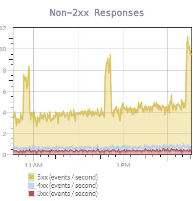
See a Graph of Server Responses
Do you have a web server in production these days, serving either actual web pages or web service responses? Most operations do, in some capacity or another. This means that you’re routinely sending back HTTP response codes over the wire.
Wouldn’t it be useful to see how these break down? Something like this?

A lot of folks might think to monitor the general case of server errors, but why not see everything that’s happening? Of the errors that happen, are they mostly on the users or on your software? Are you seeing significant variance in the percentages? If so, wouldn’t you want to look into why?
Keep an Eye on Log Event/File Volume
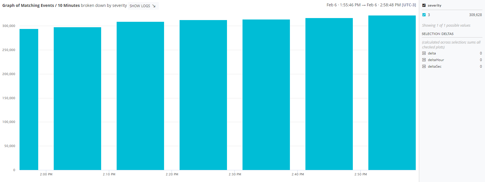
Here’s a practical one for you: try monitoring the volume of the data going into your log aggregation service each day.
However you’re doing this, there’s a decent chance that it directly impacts your wallet. More money for more data processing or more money for more storage. Whatever the case may be, you probably have a sliding scale.
While this probably doesn’t break the bank, keeping an eye on it would be nice. You could then see in real time whether you were approaching a certain threshold as well as predict your cost on an ongoing basis. Including this as part of a dashboard would let you keep immediate and extremely clear tabs on it.

What Are Your Use Cases for Log Visualization?
The purpose of this post was not to call out every use case of log visualization. I couldn’t do that even if I spent tens of thousands of words and many posts trying. So I clearly won’t do it in one.
Instead, I was just hoping to give you some ideas for seeing a common practice in a new light. It’s easy to think of logs as the equivalent of your house’s attic. Just stuff everything in there and sort it out later, if you ever really need to find something.
But they can be so much more powerful than that when you treat them as data. And data gets even more powerful when you visualize it.
So what are you doing with the visualization of your log files? What’s in your dashboard and what do you keep an eye on? Weigh in below in the comments.
Also, don’t forget to give Scalyr’s offering a try. It’s a full-fledged log management solution, packed with powerful features that include built-in and custom dashboards that can help you with visualization.


